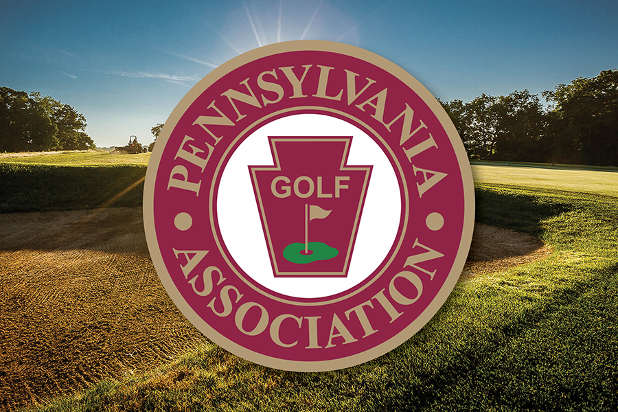
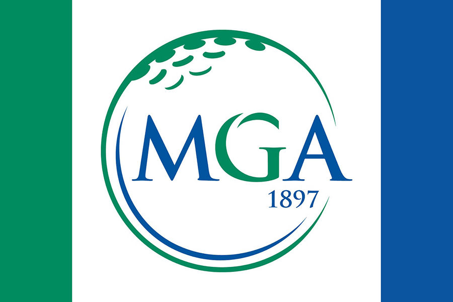
If one of your friends drastically changes his or her hairstyle, you notice immediately, right? A “looks good” or “what did you do to your hair?” generally follows. GAP supporters surely have noticed the organization’s mane change by now. The new GAP logo is the centerpiece of a rebranding. It expresses a message of unity and longevity, representative of the oldest regional/state golf association in the nation. The new logo has four distinct parts: the shield, the GAP acronym, golf clubs and 1897. You’re going to like the way we look. We guarantee it.